Are you struggling with selecting the right colors to paint your cabin, rustic mountain lodge or ski chalet?
As you may know, I am an interior designer. And yet, a number of years ago, I was contacted by a stranger who had somehow heard about me, asking me if I would be willing to recommend exterior paint colors for a condo development in Tahoe. Although this was not my specialty at all, I agreed to do it. Since then, I have done dozens of exterior paint consults on mountain houses, large, small, old and new. People seem so genuinely stumped about what to paint their cabins that I generally agree to help out.


I think that in general, many people, especially second home owners, feel uncomfortable about what colors to select for their mountain home, whereas, they might have little problem finding an easy solution for their suburban or city home.
Of course, color preferences are regional anyway. Certain colors just look better in certain environments or on particular styles of houses. You wouldn't paint a mountain house in peach or terracotta, and yet, those colors look wonderful in Southern France or Southern California. And while an ocean cottage in New England looks great with white paint and black shutters, a scheme like that just lies flat in the mountains.
Nowadays, in Tahoe, new houses use mostly transparent stains, not paint, and the stains look wonderful as they let the natural wood grains show. Unfortunately, if you've got an older cabin, however, stain is not an option because once paint has been used, it can only be covered over with another paint.
So, let's talk about paint color for older cabins.
In the mountains, cabins pop in earthy woodsy tones. Rich shades of browns, greens and grays look smart and right here. And, of course, you do see these tones everywhere reflected in the woods, the soil, the pines, the boulders and the bark.
I also like to see certain earthy gold tones and yellows on mountain homes as well as reds, used as accent colors. You do see these colors up here in summer grasses or wild flowers in our mountain meadows. And in the autumn, these colors are everywhere.
I do like gray paint here, but too often I see pale gray paint with white trim. That's just plain boring and it can turn an interesting house into something unremarkable. Even worse, people often select a cool gray, whereas a warmer, muddier gray tone works better here. The house below, uses a nice strong gray, however, and importantly, has popped the gray with lots of rusty red.

Here, the grey is rich and muddy. Also, the red is repeated in several places with red windows, red front door and a fabulous rusty red corrugated roof. Not only that, take a close look at the chimney on the left side of the house, and you'll see a lot of red and gray toned rocks. One of the secrets to making any color combination work is repetition. Repeat almost anything enough times and it starts to make sense in the brain. And, did you spot it? There is one more fabulous red in this photo, the red cotoneaster shrub in the garden. I wish they'd planted more of these!
There are two additional colors in the house above that make everything come together so well. One is black. Even though there is very little of it, the black iron square rivets and strappings on the entry supports give this house punctuation and personality. If these were painted almost any other color, it just wouldn't be the same (although I could see them working in a deep earthy moss green, too.)
The second color is the bright yellow green you see in the shrubs and plantings. Red and green are complimentary colors and using this bright green emphasizes all the wonderful red elements all the more.
I also like a color I'll call Mouse, but it's really a color that is sort of half brown and half gray. It just works in Tahoe. Sometimes I'll use it in a deep dark, almost black version, but I like it in light and medium tones just as well. Below, we see it in a medium brown.

This is really the simplest little cabin, but it is on the main road that winds around the lake and every time I drive by I do a little double take. It's a small houses hidden between trees and kind of hard to spot and yet, those red shutters just light it up. Also, because the gray/brown "mouse" paint is dark enough, using creamy white as the trim paint looks crisp and fresh. Don't you agree? And look at how beautifully the red contrasts with the rich green on the fir needles. Again, a complementary color combination that sets up just enough tension in your vision to create a little excitement.
On Old Tahoe cabins, I always love warm brown paint colors with creamy yellow trim. You don't see it that often, but it always works, like in this charmer, below.

This house has a spectacular wrap around porch all done up in that wonderful old river rock. It's a little hard to tell in the photo, but the rock really does have soft creamy areas where the light reflects on it, repeating the color of the yellow trim. The taupy-gray roof, which is very visible in one's view of the house is also seen in the soft grays and browns of the stone porch walls. It all just looks so harmonious, welcoming, warm and charming. There are several of the dark green umbrellas placed around the porch which add a lot of personality to the overall impression of this house.
If you're a brave soul and love color, you might consider a gold house like in the photo below.


Perhaps you feel like you could use a little help finding the perfect paint combination for your mountain house, too. With so many requests for help with exterior colors, I've put together a document that gives lots of suggested cabin paint color combinations, including paint product numbers so you can just go to the paint store and buy the exact scheme shown. I've included all my favorite combos from past projects and also some great ideas from beautiful homes I've photographed around Tahoe.
There are so many great color combinations in this downloadable PDF that you're sure to find something that works perfectly for your cabin.
As you may know, I am an interior designer. And yet, a number of years ago, I was contacted by a stranger who had somehow heard about me, asking me if I would be willing to recommend exterior paint colors for a condo development in Tahoe. Although this was not my specialty at all, I agreed to do it. Since then, I have done dozens of exterior paint consults on mountain houses, large, small, old and new. People seem so genuinely stumped about what to paint their cabins that I generally agree to help out.


I think that in general, many people, especially second home owners, feel uncomfortable about what colors to select for their mountain home, whereas, they might have little problem finding an easy solution for their suburban or city home.
Of course, color preferences are regional anyway. Certain colors just look better in certain environments or on particular styles of houses. You wouldn't paint a mountain house in peach or terracotta, and yet, those colors look wonderful in Southern France or Southern California. And while an ocean cottage in New England looks great with white paint and black shutters, a scheme like that just lies flat in the mountains.
 |
| Adorable in the suburbs, but not in the mountains! |
So, let's talk about paint color for older cabins.
 |
| Grays, Greens and Browns Predominate in the Woods |
 |
| Reds and Golds are Beautiful, Too! |
I do like gray paint here, but too often I see pale gray paint with white trim. That's just plain boring and it can turn an interesting house into something unremarkable. Even worse, people often select a cool gray, whereas a warmer, muddier gray tone works better here. The house below, uses a nice strong gray, however, and importantly, has popped the gray with lots of rusty red.

Here, the grey is rich and muddy. Also, the red is repeated in several places with red windows, red front door and a fabulous rusty red corrugated roof. Not only that, take a close look at the chimney on the left side of the house, and you'll see a lot of red and gray toned rocks. One of the secrets to making any color combination work is repetition. Repeat almost anything enough times and it starts to make sense in the brain. And, did you spot it? There is one more fabulous red in this photo, the red cotoneaster shrub in the garden. I wish they'd planted more of these!
There are two additional colors in the house above that make everything come together so well. One is black. Even though there is very little of it, the black iron square rivets and strappings on the entry supports give this house punctuation and personality. If these were painted almost any other color, it just wouldn't be the same (although I could see them working in a deep earthy moss green, too.)
The second color is the bright yellow green you see in the shrubs and plantings. Red and green are complimentary colors and using this bright green emphasizes all the wonderful red elements all the more.
I also like a color I'll call Mouse, but it's really a color that is sort of half brown and half gray. It just works in Tahoe. Sometimes I'll use it in a deep dark, almost black version, but I like it in light and medium tones just as well. Below, we see it in a medium brown.

This is really the simplest little cabin, but it is on the main road that winds around the lake and every time I drive by I do a little double take. It's a small houses hidden between trees and kind of hard to spot and yet, those red shutters just light it up. Also, because the gray/brown "mouse" paint is dark enough, using creamy white as the trim paint looks crisp and fresh. Don't you agree? And look at how beautifully the red contrasts with the rich green on the fir needles. Again, a complementary color combination that sets up just enough tension in your vision to create a little excitement.
On Old Tahoe cabins, I always love warm brown paint colors with creamy yellow trim. You don't see it that often, but it always works, like in this charmer, below.

This house has a spectacular wrap around porch all done up in that wonderful old river rock. It's a little hard to tell in the photo, but the rock really does have soft creamy areas where the light reflects on it, repeating the color of the yellow trim. The taupy-gray roof, which is very visible in one's view of the house is also seen in the soft grays and browns of the stone porch walls. It all just looks so harmonious, welcoming, warm and charming. There are several of the dark green umbrellas placed around the porch which add a lot of personality to the overall impression of this house.
If you're a brave soul and love color, you might consider a gold house like in the photo below.

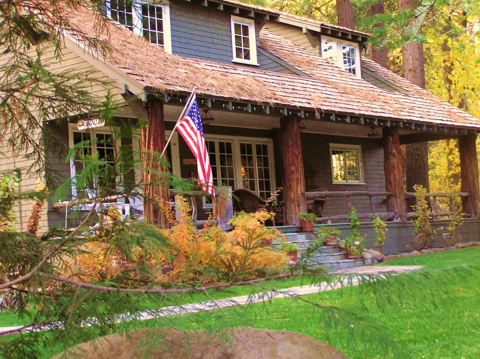
Adding mossy green and intense red to this house has given it character. Adding changes of materials always adds extra interest and character. Here the stained shingles and river rock bring so much to this house. This rather unremarkable cabin has been made special with these details. (If you try this at home, don't forget the red adirondack chairs, the twin carriage lanterns, the flag and the perfect lawn!)
Finally, let's look at a lovely muddy green that I just love in Tahoe.
Again, creamy white trim sets off this beautiful muddy sage color to perfection. Unpeeled log supports add just what this house needs to make it special. Of course, a wonderful porch, another perfect lawn, and wicker seating all contribute to the perfection.
Perhaps you feel like you could use a little help finding the perfect paint combination for your mountain house, too. With so many requests for help with exterior colors, I've put together a document that gives lots of suggested cabin paint color combinations, including paint product numbers so you can just go to the paint store and buy the exact scheme shown. I've included all my favorite combos from past projects and also some great ideas from beautiful homes I've photographed around Tahoe.
 |
| Exterior Paint Color Combinations for Mountain Homes |